Wednesday, April 23, 2008
Thursday, April 10, 2008
3/4 jury review
Present information in a clear and precise maner.
-Organization => create a grid and categorize everything
Enlarge and detailed drawings
-Highlight aspects
-Clearly labeled
-shrink site plan
Portray how sustainability is the heart of the building
Modeled details in section showing wind movement and sun angles
Exemplify technology better (also aesthetically pleasing and beautiful spaces)
-make computer model more lively and pleasing
Diagram program and groups
-overlay plan with site
-cast shadows
-how wind rose is integrated into the system
-visual aspects of space in winter, summer, spring and fall
Site sections
Development
-wind wall
-play with existing roof lines (melt together)
-how to get the most out of each drawing/model
Tuesday, March 25, 2008
Comments

The above picture is how the buildings sit on the site with the surrounding structures.
Comments:
-Stylize the passive and active buildings.
-Show how the educational building comes together.
--How they collide
--Details
-Create an attractive entrance
-Make the spaces have a warm quality (they look a little cold)
-Show sustainable stratagies for parking lot
-Begin to build a study model and show connection between spaces in educational builidng.
The Library


The library is an atrium space with the administration offices and storage room overlooking it from the second floor. Windows are located along the south and east sides with overhangs. This allows a lot of light into the area for easy reading and studying. This will also heat the space in the winter. The bookshelves are designed and aligned in a way to direct winds through this large space to help cool it in the summer. The area also holds a study area and glass interior walls to allow light to penetrate into other areas of the building. There is also a quick formz drawing of the layout for the bookshelves.


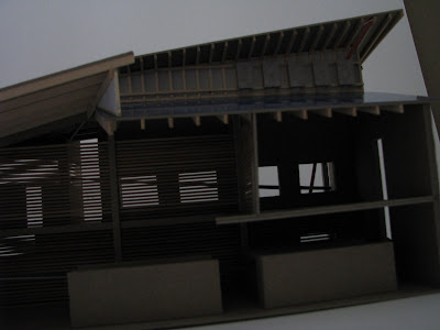
The roof of the exhibition galler is angles in ways to allow light into certain areas and to make use of the different angles of the sun as it moves across the sky. By lining the glass of the roof systems with photovoltaics, it is possible to allow light into the interior space while at the same time preventing overheating. The structure is of laminated beams to reinforce this idea of sustianable materials.
exhibition gallery

The images above are of the exhibition gallery located in the center of the educational building. There are several shops joined to it located along the souther side of the space. This allow people to view the exhibition while enjoying thier coffee. There is a water wall in the center of the room shaped in a way to direct winds and to allow for evaporative cooling while the wind moves across the form. The roof of this space is broken into several peices and angled in a way to take advantage of the path of the sun. Photovoltaics line the glass on the roof in a way to allow sunlight in while at the same time shading certain areas to prevent overheating. This space has mostly glass to make it as warm and lively as possible.
Subscribe to:
Comments (Atom)


